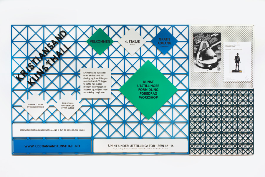
The signage-wall in the art centre's entrance
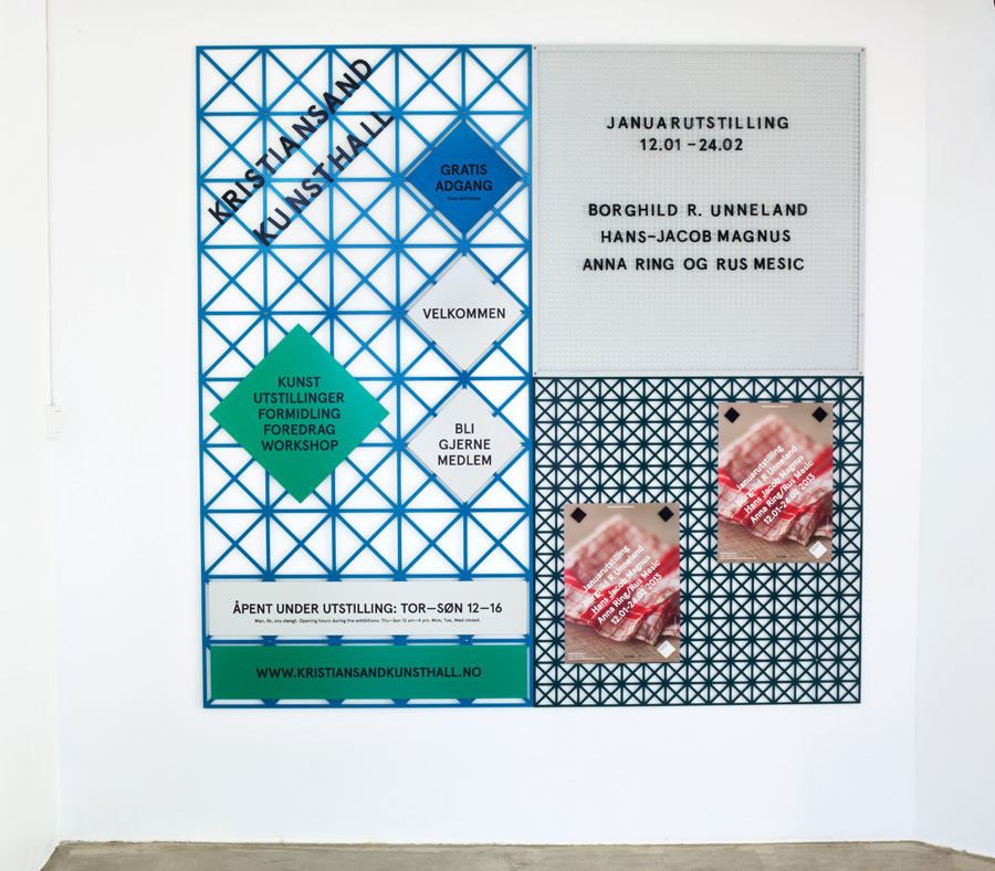
The smaller signage-wall in the art centre's reception
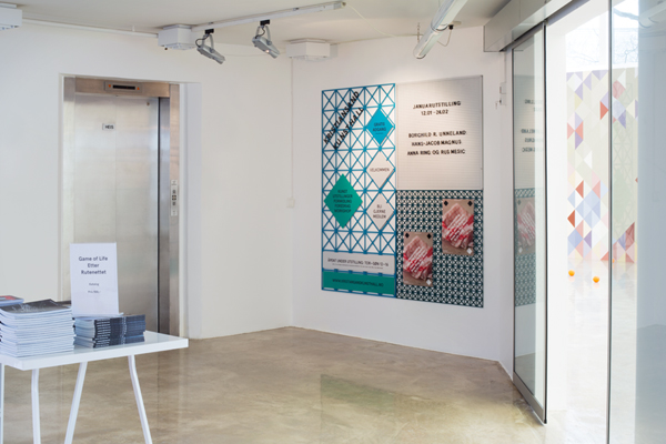
The signage in the kunsthall reception

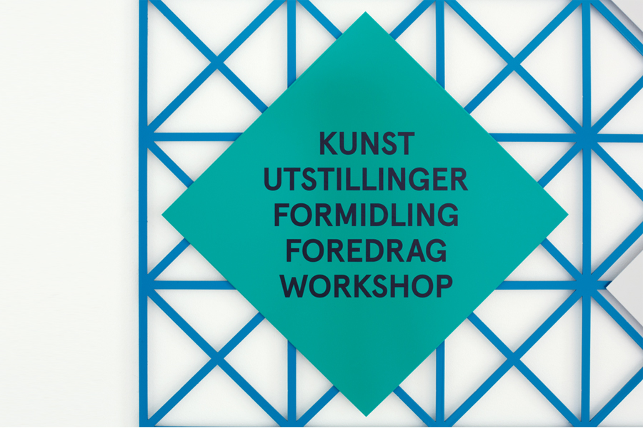
Flexible programme board with magnetic letters
Laquered metal letters forming the logo
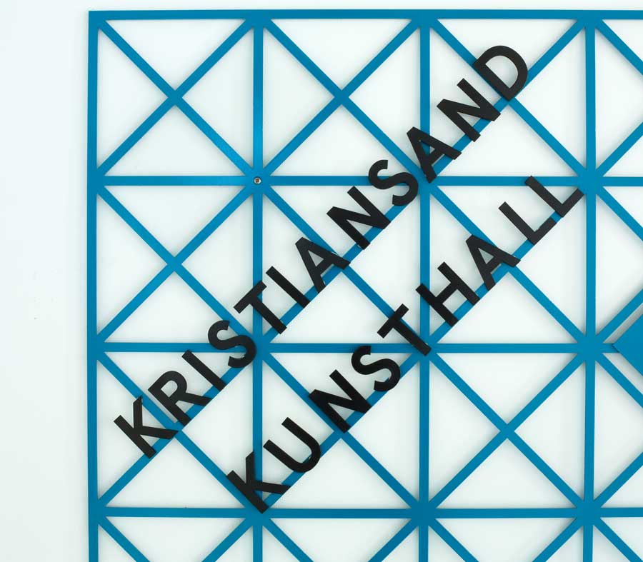
Detail
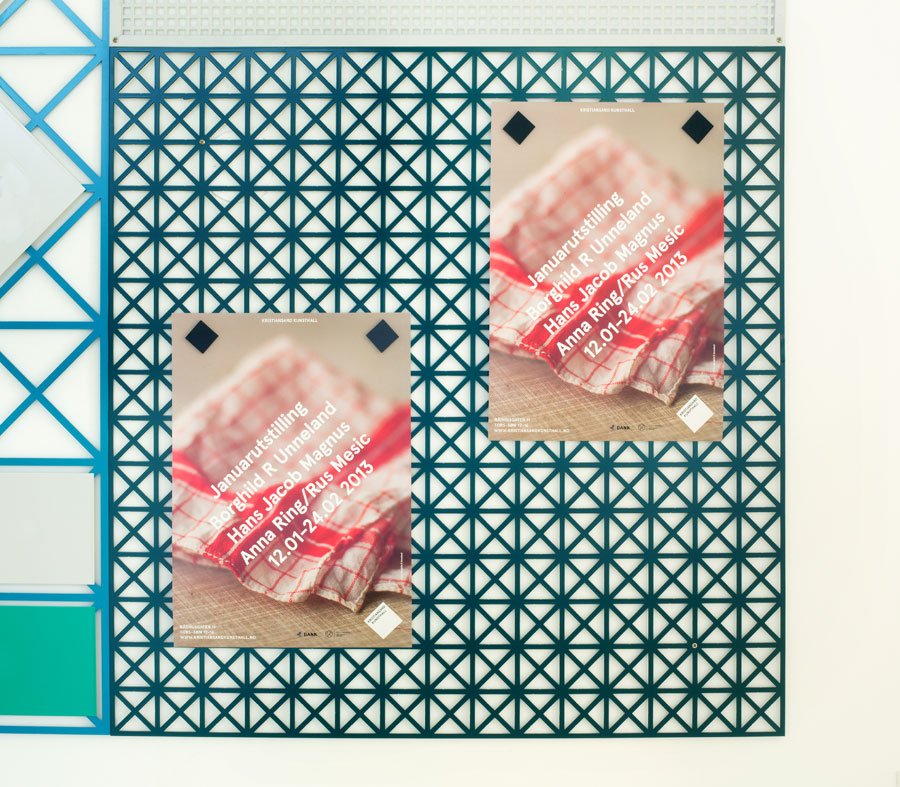
Posters hung up with custom-made magnets
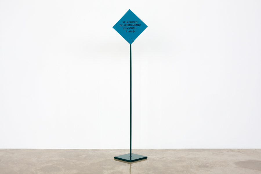
Free-standing sign